
SENIOR THESIS
✰
SENIOR THESIS ✰
I made a typeface!
HEADLINER

Project
Artists of both the visual and auditory mediums ultimately strive toward one goal: to deeply impact and inspire their audience. For this thesis project, I embraced both my graphic design skills and musical creativity to design a typeface inspired by sound that can be used for music advertisement. Looking at the world through a design and music lens, I found that both fields greatly complement each other when employed strategically, making their respective products increasingly comprehensive and desirable. Music wouldn’t be advertised without design, and design becomes stagnant without employing musical qualities such as rhythm, contrast, and harmony. Typically, music or design is put on the back burner in terms of research and execution, but I believe type design can be a bridge to marry the two. With a striking, unique, legible, and rhythmic typeface, design can highlight what the music is trying to convey: it can provide aesthetic, functionality, and audience inspiration through letterforms. Centered around how design can emulate this visual communication for music through typography, I embarked on this project with the goal of creating a visual language for music professionals inspired by sound and the musical creative process.
➪
The DEFENSE
Featured on Blurb’s “The Interviews” series, blog, and staff pics, I spoke with Dan Milnor about merging design and music by weaving rhythm, harmony, and movement into letterforms. After all, every thesis needs a defense (right?).

click to preview the process book outlining each step of the way

test (or purchase) the
typeface on Creative Market

HEADLINER GALLERY INSTALLATION

PROCESS BOOK
ALPHABET AUDIT

PROCESS BOOK
TABLE OF CONTENTS

HEADLINER GALLERY INSTALLATION

PROCESS BOOK COVER
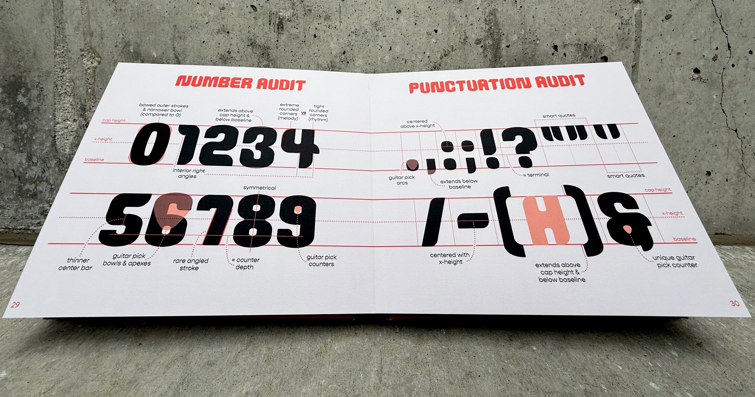
PROCESS BOOK NUMBER & PUNCTUATION AUDIT

HEADLINER
GALLERY INSTALLATION

PROCESS BOOK
FULL CHARACTER SET